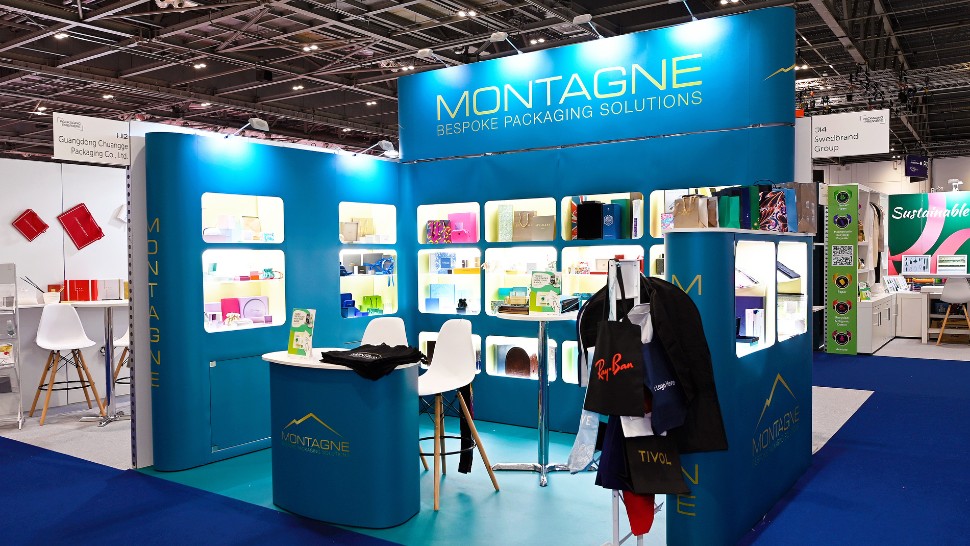
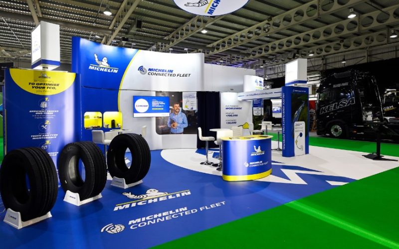
Exhibiting can be an expensive investment, even with all the value it brings. Exhibitions offer unparalleled face-to-face marketing opportunities; meeting existing and prospective clients, generating leads, showcasing products and gaining brand awareness. But a strong exhibition stand can come at considerable expense. With this in mind, you can see why many companies want an exhibition stand design that lasts.
Of course, for an exhibition stand to last, it needs to be reusable. Reusable stands tend to be modular, utilising multiple reusable components. Modular exhibition stands often use an expandable aluminium frame, enveloped by gorgeous panoramic graphics. They are reconfigurable, meaning they can be rearranged to create different stand configurations and suit different stand spaces and sizes. Designing a stand to last through the seasons doesn’t mean using the same stand each time, but there are still some key points to consider in the design.
The benefits of a Lasting Design
Using a stand that lasts for at least a full exhibition calendar has many benefits. The first, and arguably greatest reason is the cost-savings. A reusable stand will save you a lot of money if you have multiple exhibitions throughout the year. For example, where a custom-build stand might cost £20,000 for every show, a reusable stand could cost the same for an entire year!
Secondly, reusable exhibition stands are eco-friendly and sustainable. Custom-builds, also known as “build ‘n’ burn” stands are built to last just two-to-three days before being thrown into landfill. These stands are the greatest contributor to a deep-rooted issue with waste in the industry. Modular stands, in contrast, can be reused time and time again, for beautiful, sustainable exhibiting.
Consistency in design is one fantastic benefit of a lasting design. If you’re exhibiting at multiple shows across Europe, with different contractors each time, your branding can begin to look messy, inconsistent and unprofessional. A modular design reuses graphics, even if the stand is arranged differently. This means you have the same branding throughout each show, reinforcing your brand and building recognisability.

A Design That Lasts
Knowing the great benefits of a reusable stand, how do you actually craft a design to last? Designing for longevity can seem challenging, but there is a recipe for success.
Messaging
For the brand messaging, think about long-term taglines. Viewers need to know who you are and what you do! Start with, a brand name or “headline” – usually placed high up on the stand! For example, on the Michelin stand, the high-level graphics feature the iconic Michelin man and logo, and the brand name “Michelin Connected Fleet” – simple yet effective. Secondly, the stand should feature the brand’s lasting message. This introduces who you are! It’s the short tagline that tells viewers what you do, and your experience in the field. Thirdly, the stand should include a call to action to get the viewer to perform a desired action. This can be a QR code to guide visitors to a contact page or a lasting message like Michelin’s “unlock your fleet’s full potential”.
Visuals, Images, Aesthetics
Visuals and images should be engaging but in line with branding! Try to think about colours and themes that complement your long-term brand image. People often fall into the trap of designing a stand around the themes of a product launch, which caps the stand’s lifespan. A good rule of thumb is to stick with three colours. Two are brand colours (these often reflect the website) and a third colour softens and compliments the overall finish. Imagery also adds visual interest and communicates the brand’s story. Though the brand colours, iconography and images might tie into the website, it’s best to use a specialist designer. When working in large-format print, everything is magnified, and an expert touch is needed to ensure everything looks flawless.
What about Specific Launches
By this point, you might be wondering how you will communicate your specific launches. The beauty of modular stands is that panels can be added or removed as needed to stay relevant. Dedicate one or two graphic panels to your products and product launches. These can be changed/swapped out to represent the branding. Some companies have a showcase with lighting for year-round product display and one informational graphic that is altered to stay up to date. Some contractors even extend graphics to the floor, and these can be altered to represent the current launches!
A Modular Exhibition Stand Designer
Modular exhibits and hire stands were pioneered in Europe by exhibition stand designer, Quadrant2Design.
Quadrant2Design is an expert in high-impact, sustainable, modular design, based in the UK, but designing and installing all across Europe!
Quadrant2Design stands are custom-designed, yet reusable. This means they use the modular reusable structure, and high-impact panoramic graphics, but also host bespoke and custom features to create a stand-out display.
Summing Up
Creating a lasting exhibition stand design is crucial to saving costs, acting sustainably, and maintaining consistent branding across multiple shows.
By focusing on reusable modular designs, long-term messaging, engaging visuals, and specific panels for specific launches, companies can ensure their exhibition stands remain impactful and relevant throughout the seasons.
If you’re looking for an expert in high-impact, sustainable, modular design, consider reaching out to Quadrant2Design, a leading exhibition stand designer specialising in reusable and custom-designed modular exhibition stands. A team of design consultants at Quadrant2Design specialise in creating exhibition stands that can be reused and developed across a calendar.


